Why designers are moving past all-white rooms in 2026 — and exactly how to use saturated color without it overwhelming a space.
For years, the safe answer to “what color should I paint this room” was some version of white or greige. That era is fading. In 1stDibs’ latest annual survey of hundreds of interior designers worldwide, maximalism and eclecticism are now the two most requested styles, and chocolate brown has taken over as the single most popular color among professionals. Bold color isn’t a risky, fringe choice anymore — it’s where a large share of the design world is actually heading. Here’s how to use it well, without ending up with a room that feels chaotic instead of confident.
Why Bold Color Is Having a Real Moment in 2026
This shift isn’t happening in isolation — it follows years of desaturated minimalism, and designers describe the current mood as a deliberate reaction to it.
- After a long wave of all-white, muted interiors, the design world has moved toward rich, saturated color schemes with real depth, without swinging back to a purely maximalist, anything-goes look.
- “Color drenching” — painting walls, trim, and ceiling all in one saturated color — is expected to be a major technique in 2026, with burgundy and chocolate brown as leading choices.
- Softer but still confident hues — butter yellow, cornflower blue, baby pink, and pistachio — are also gaining ground as an entry point for people not ready for a fully saturated room.
- Wallpaper is having a strong resurgence, with designers reporting plans to use it across entire rooms, ceilings included, rather than as a single accent wall.
1. Understand Color Drenching Before You Try It
Color drenching means applying one saturated color to every surface in a room — walls, trim, ceiling, and sometimes even built-in furniture — rather than the traditional approach of white trim and ceilings framing a colored wall. The effect removes visual breaks in the room, which can make a small space feel more cohesive and intentional rather than choppy.
- Chocolate brown and burgundy are the two colors most cited by designers for this technique in 2026, both offering depth without reading as cold or stark.
- Color drenching tends to work best in rooms with strong architectural detail (moldings, built-ins) since the single color unifies rather than hides those features.
- For a lower-commitment version, drench a smaller room first — a powder room, entryway, or reading nook — before applying the technique to a main living space.
2. Choose Your Bold Color Based on the Room’s Job
Chocolate brown and burgundy — depth and sophistication
The current top trending colors among designers, chocolate brown and burgundy work well in dining rooms, libraries, and primary bedrooms — spaces meant to feel grounded and substantial rather than bright and energizing.
Smoky blue-green — dramatic but soothing
Described by designers as feeling both dramatic and calming at once, smoky, muted blue-greens are having a strong 2026 moment and suit living rooms and bedrooms where you want boldness without losing a sense of rest.
Softer saturated tones — butter yellow, cornflower blue, pistachio
These gentler but still confident hues are a good entry point if a fully saturated dark color feels like too big a leap — they read as playful and current without the same visual weight as a fully drenched dark room.
3. Use the 60-30-10 Rule to Keep Bold Color Balanced
A classic design guideline still holds up well even in a maximalist-leaning year: 60% of a room in a dominant color or tone, 30% in a secondary color, and 10% in an accent. Applied to a bold color scheme, this keeps a saturated room feeling curated rather than overwhelming.
- Let your boldest color take the dominant 60% role — walls, or in a drenched room, walls plus trim and ceiling.
- Use a complementary secondary tone for large furniture pieces (a sofa, a rug) to keep the room from feeling like a single flat block of color.
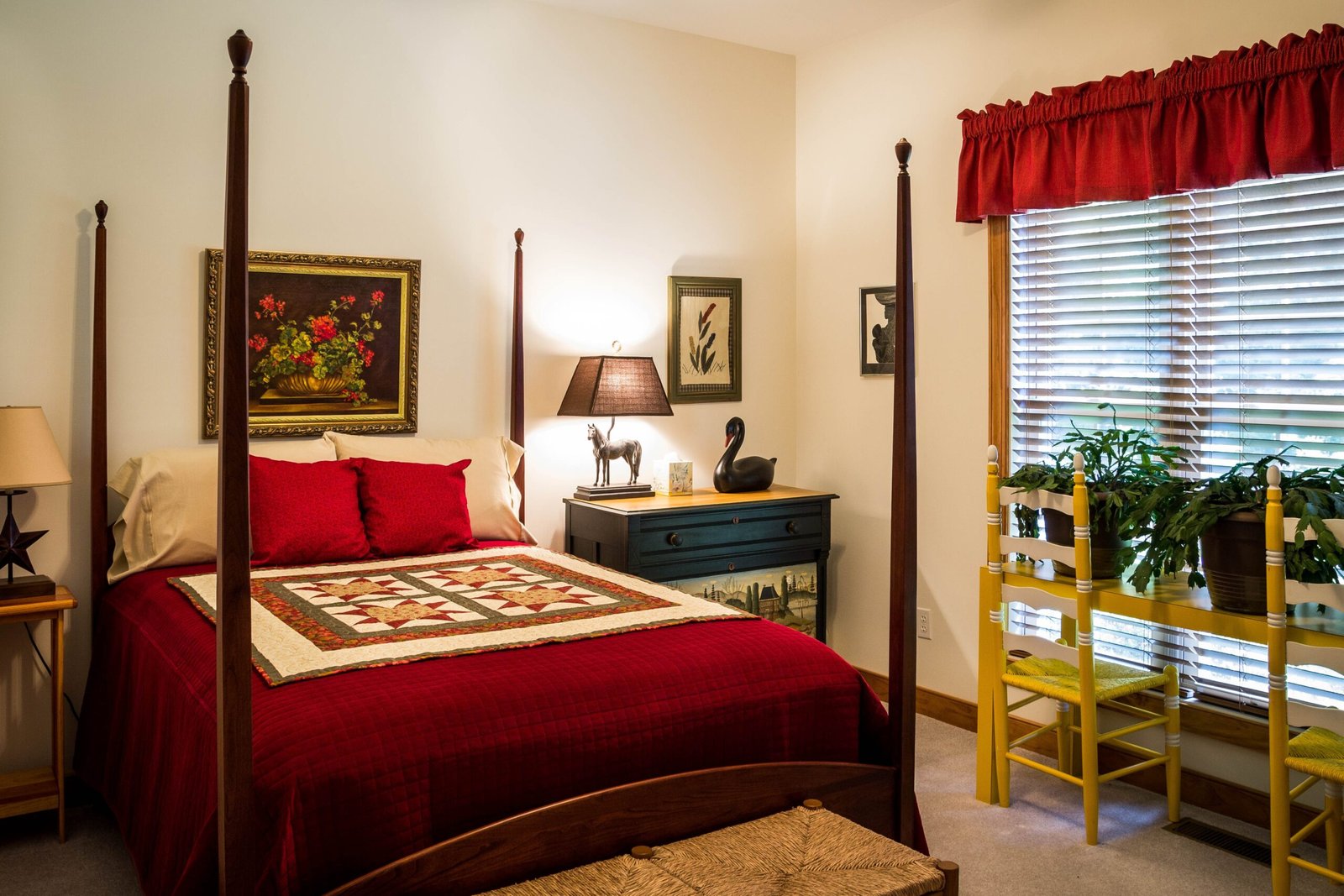
- Reserve your most saturated or contrasting accent color for the smallest 10% — pillows, art, a single statement chair — where it reads as intentional rather than accidental.
4. Test Before You Commit — Bold Color Punishes Guesswork
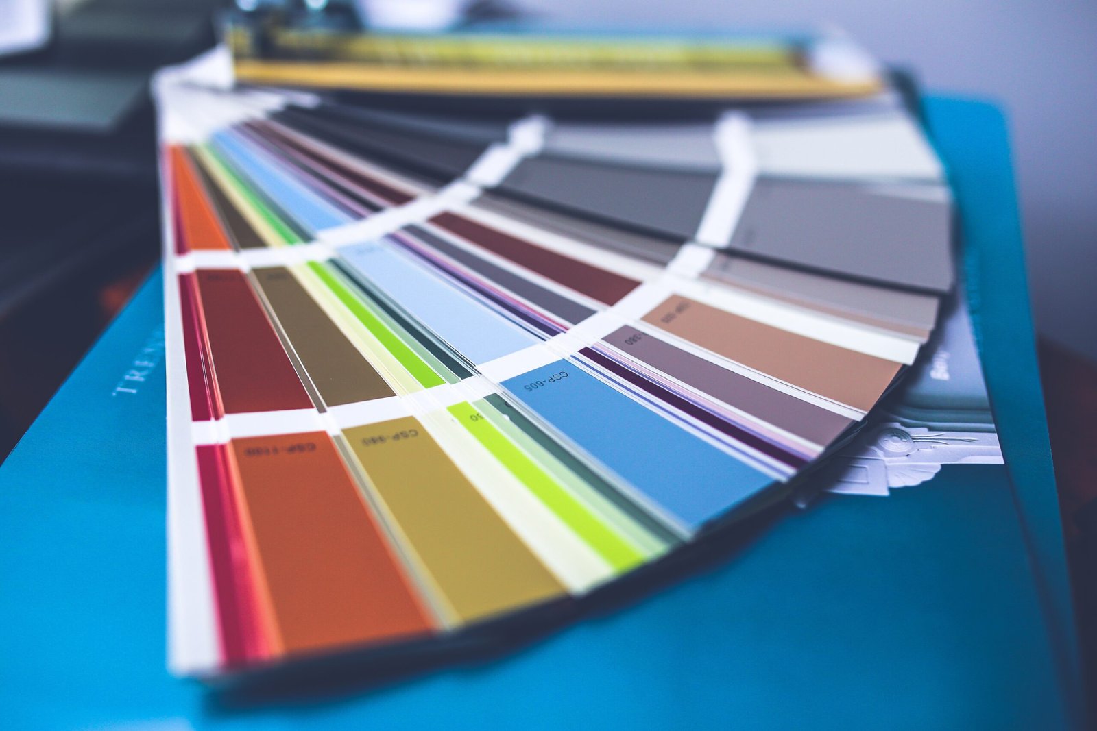
Bold, saturated color is far less forgiving of an untested guess than a light neutral. A shade that looks rich and warm on a paint chip can read completely differently across an entire wall, especially once your room’s specific lighting is factored in.
- Paint a large sample swatch — at least two feet by two feet — directly on the wall, not just a small chip, and view it at different times of day.
- Live with the swatch for at least a few days before committing to a full room, since lighting shifts dramatically from morning to evening.
- If drenching a room, also test the color on trim and ceiling separately — a color can look different applied to a vertical wall versus a horizontal ceiling under the same light.
5. Layer Pattern and Texture to Support the Color, Not Compete With It
With wallpaper and maximalism both trending in 2026, bold color increasingly isn’t being used alone — it’s paired with pattern and texture in the same room. The key to making this work is variation in scale, not matching everything to the same intensity.
- Pair a bold solid color with one patterned element (wallpaper, a patterned rug) rather than multiple competing patterns in the same space.
- Vary texture — a matte painted wall against a glossy accent, or a smooth sofa against a textured rug — to add visual interest without adding more color.
- Vintage and antique pieces, which are also trending strongly in 2026 designer surveys, tend to pair particularly well with saturated color schemes, adding warmth and history rather than competing for attention.
Not ready to drench a whole room? Start with a single piece of furniture, a door, or a powder room — bold color is far less risky when your first attempt is small and easily changed.
Common Mistakes When Going Bold With Color
- Skipping the swatch test and choosing based on a small paint chip or an online photo taken in different lighting.
- Using too many bold colors of equal intensity in the same room, which competes instead of complementing.
- Drenching a room with poor natural light in a very dark, cool-toned color, which can make the space feel smaller rather than cozier.
- Ignoring the room’s function — a highly energizing bold color in a bedroom, or a very somber one in a space meant to feel social and bright.
Want our free room-by-room bold color pairing guide with the top 2026 designer picks? Subscribe below and we’ll send it to your inbox.
Frequently Asked Questions
What is color drenching and is it hard to do myself?
Color drenching means painting walls, trim, and ceiling all in one saturated color instead of the traditional white-trim approach. It’s achievable as a DIY project, though it typically requires more careful prep and multiple coats than a single accent wall, since every surface needs even, consistent coverage.
What is the most popular paint color for 2026?
According to 1stDibs’ annual survey of hundreds of interior designers, chocolate brown is the single most cited top trending color for 2026, followed closely by burgundy, with softer saturated tones like butter yellow, cornflower blue, and pistachio also gaining ground.
Will bold, saturated color make a small room feel smaller?
Not necessarily — it depends on lighting and the specific shade. Many designers use darker, saturated colors deliberately in small rooms (like powder rooms) to create an intentional, cozy “cocoon” effect rather than trying to visually expand the space with light neutrals. Testing the color with your room’s actual lighting is the best way to judge the effect before committing.
How do I use bold color without it looking chaotic?
The 60-30-10 rule is a reliable guideline: let one dominant bold color take up roughly 60% of the room, a secondary complementary color take 30%, and reserve your boldest accent color for about 10% — small items like pillows or art. This keeps a saturated room feeling curated rather than overwhelming.
Is bold color a passing trend, or is it here to stay?
Design surveys show maximalism and eclecticism strengthening year over year rather than fading, suggesting bold color is a sustained shift rather than a single-season trend. That said, trends do evolve — choosing a bold color you genuinely love, rather than one purely because it’s currently popular, is the safer long-term bet regardless of where the trend cycle goes next.
Bold color in 2026 isn’t about throwing caution to the wind — it’s about using saturation deliberately, tested properly, and balanced with the same care as any other design decision. Start small if you need to, but don’t let “safe” be the only reason you reach for white one more time.